Light of Shaam
Restaurant Brand
Restaurant Brand
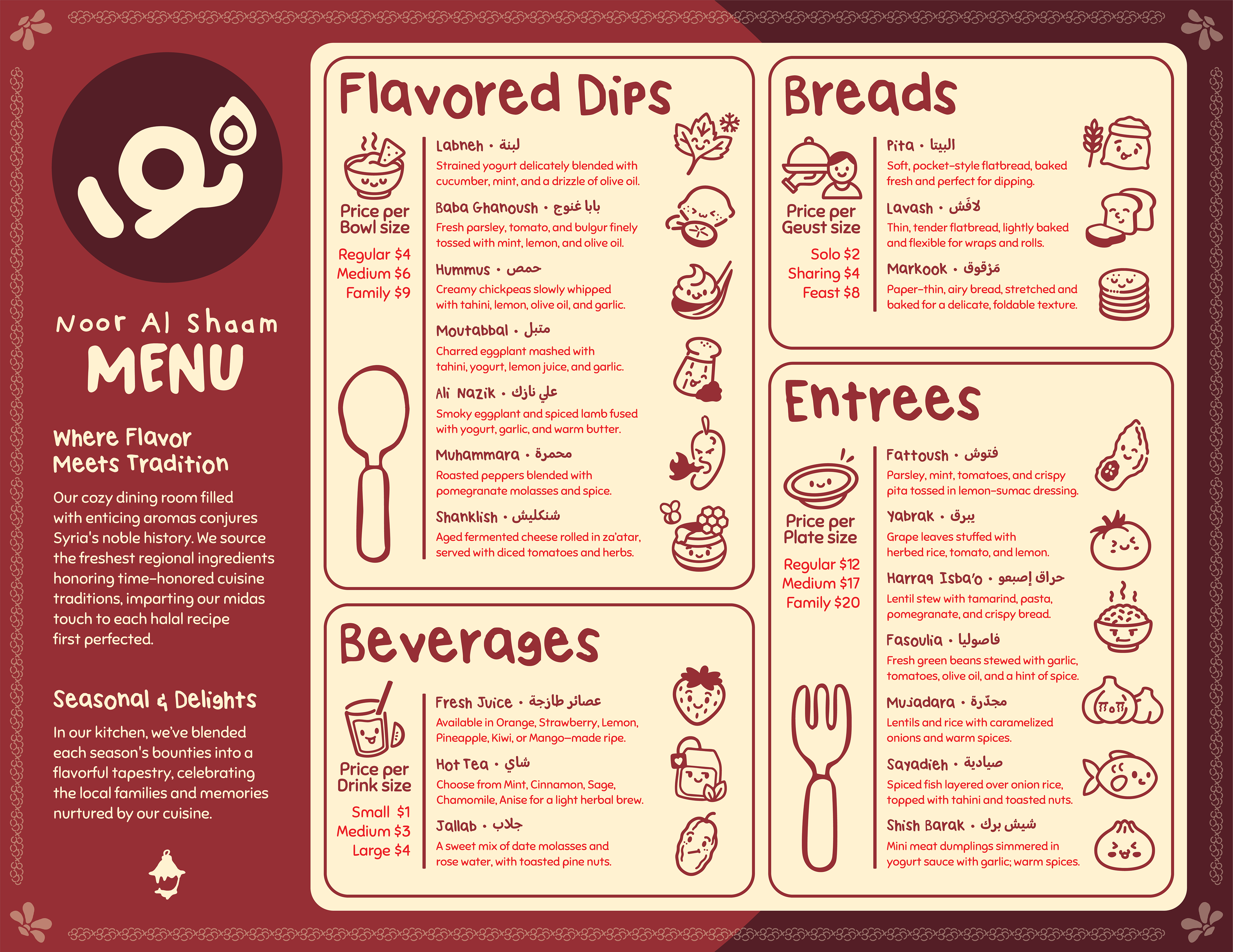
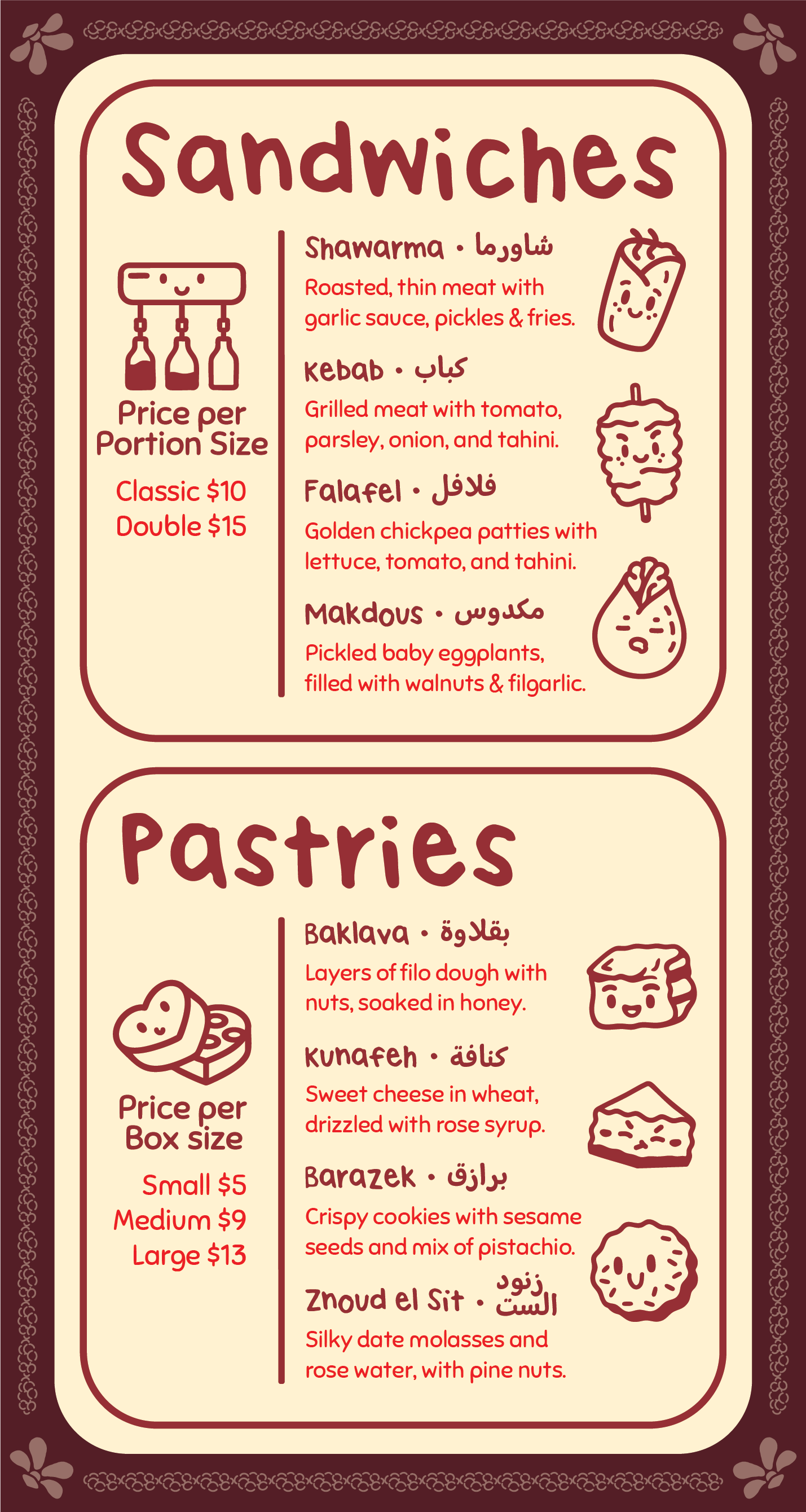
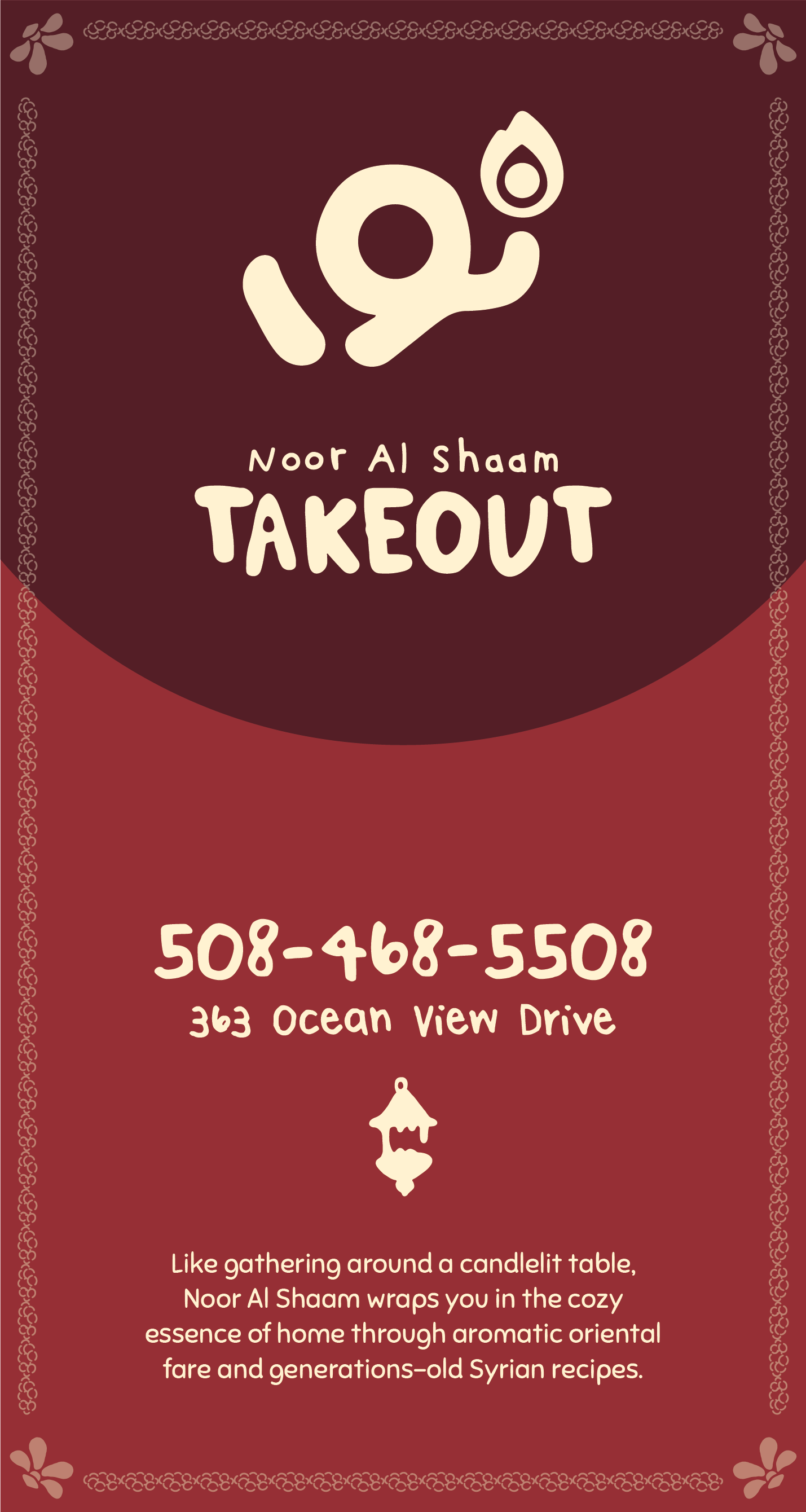
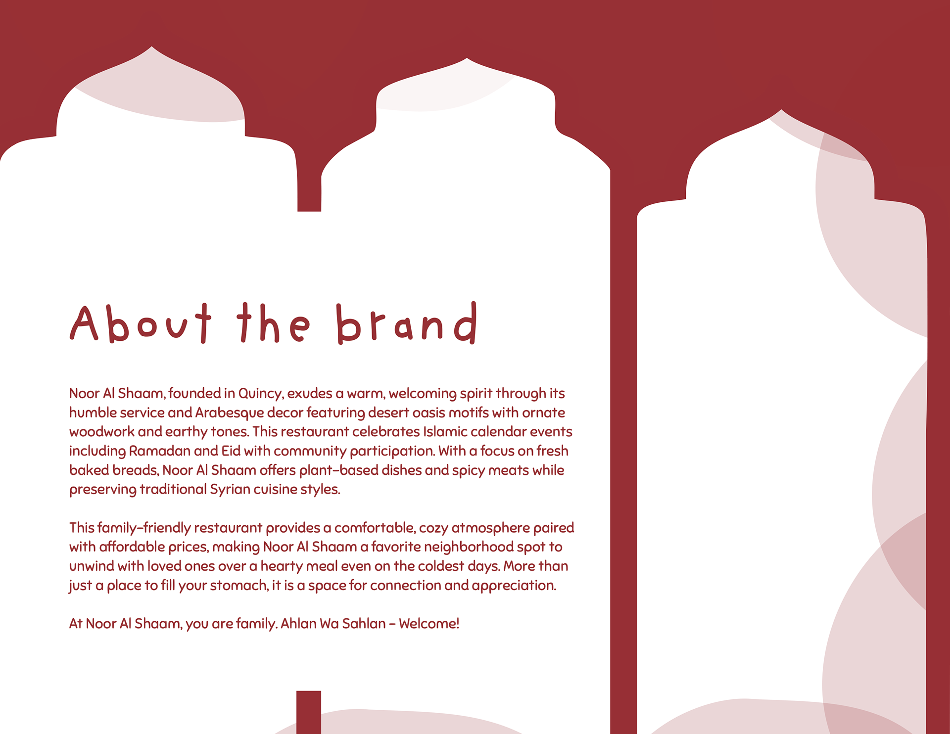
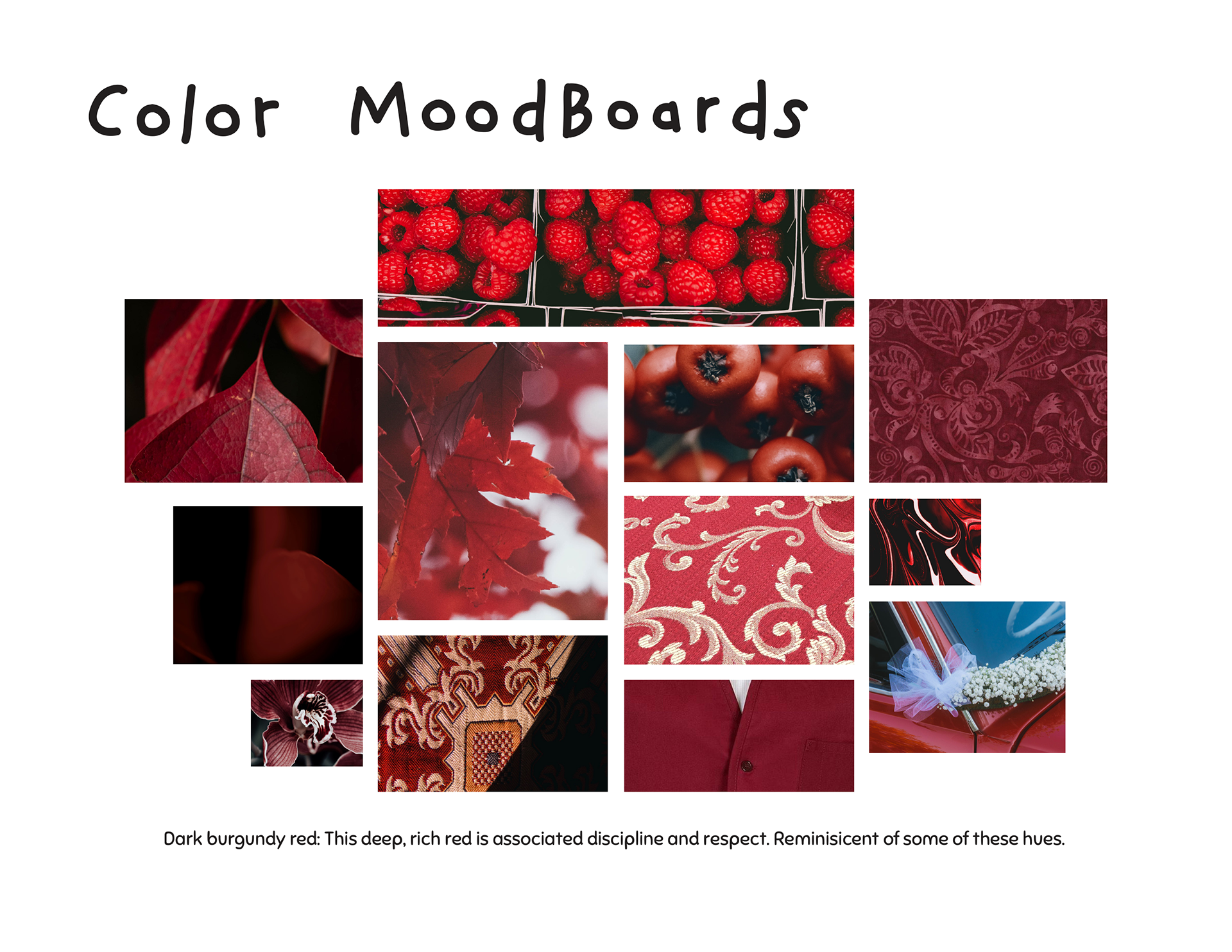
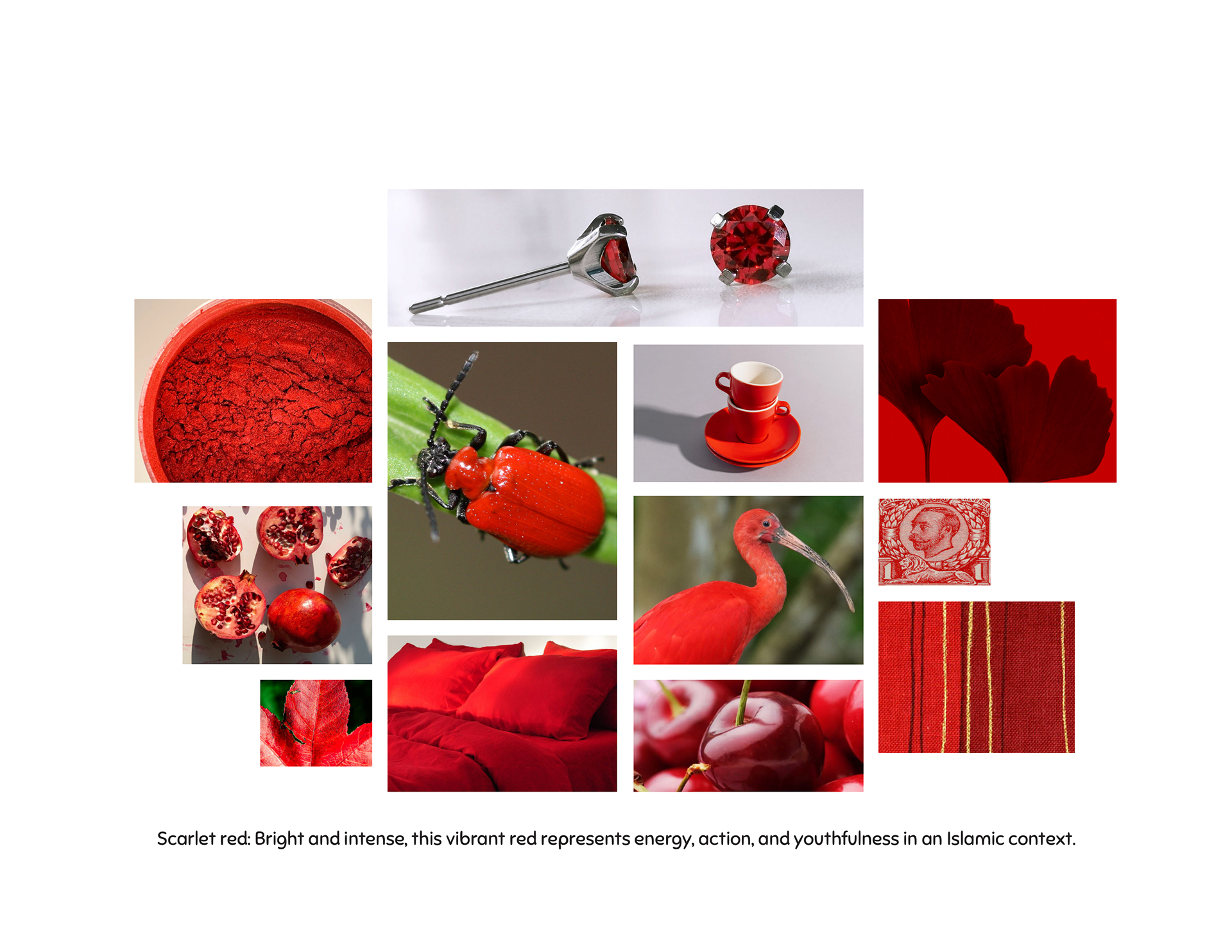
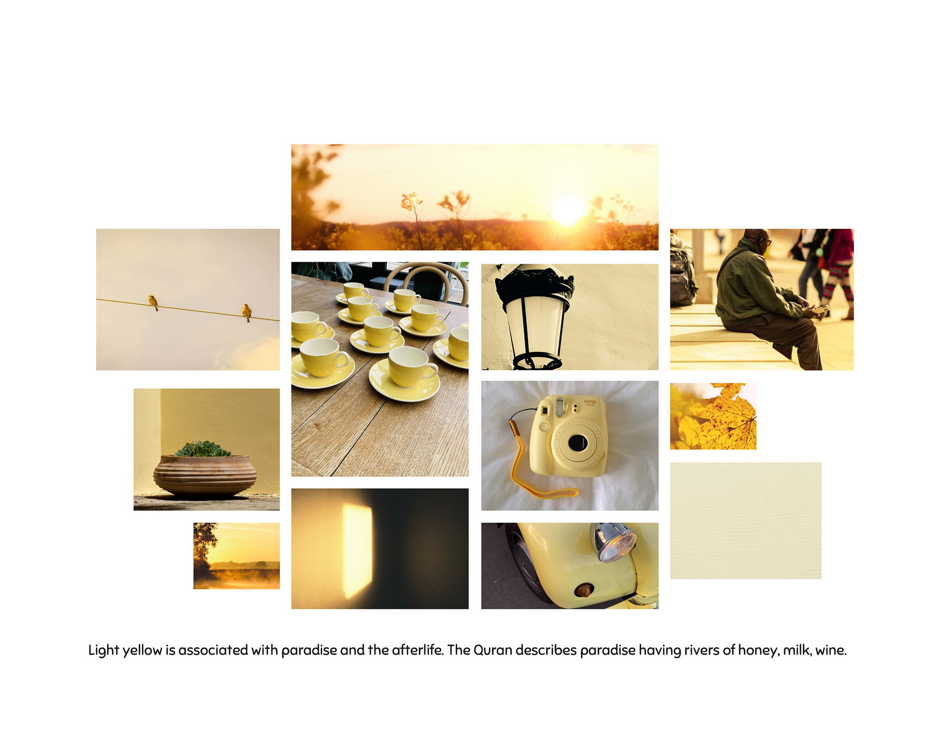
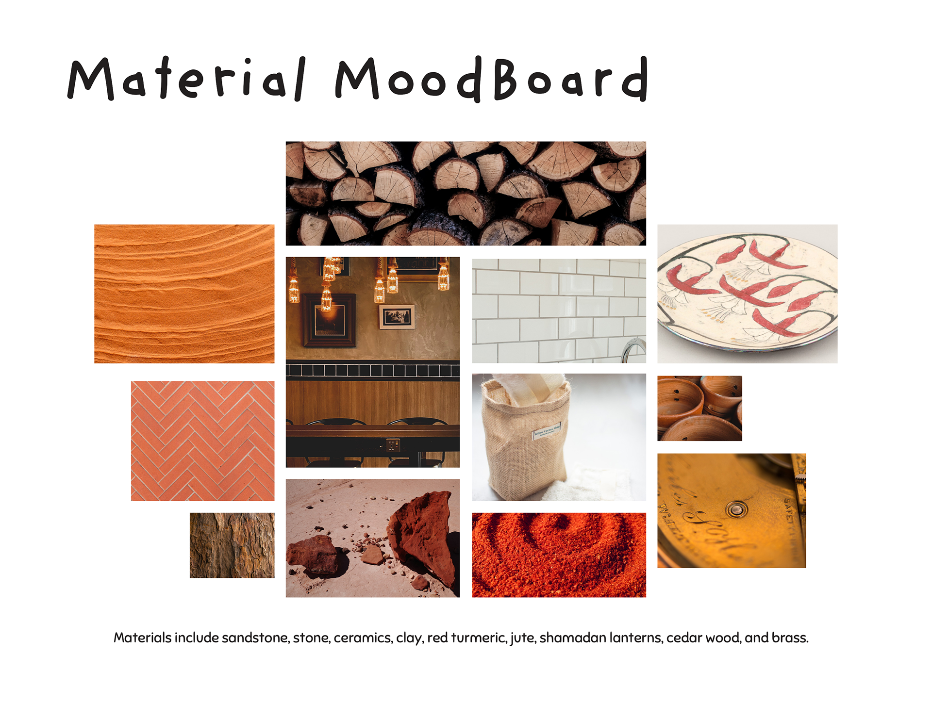
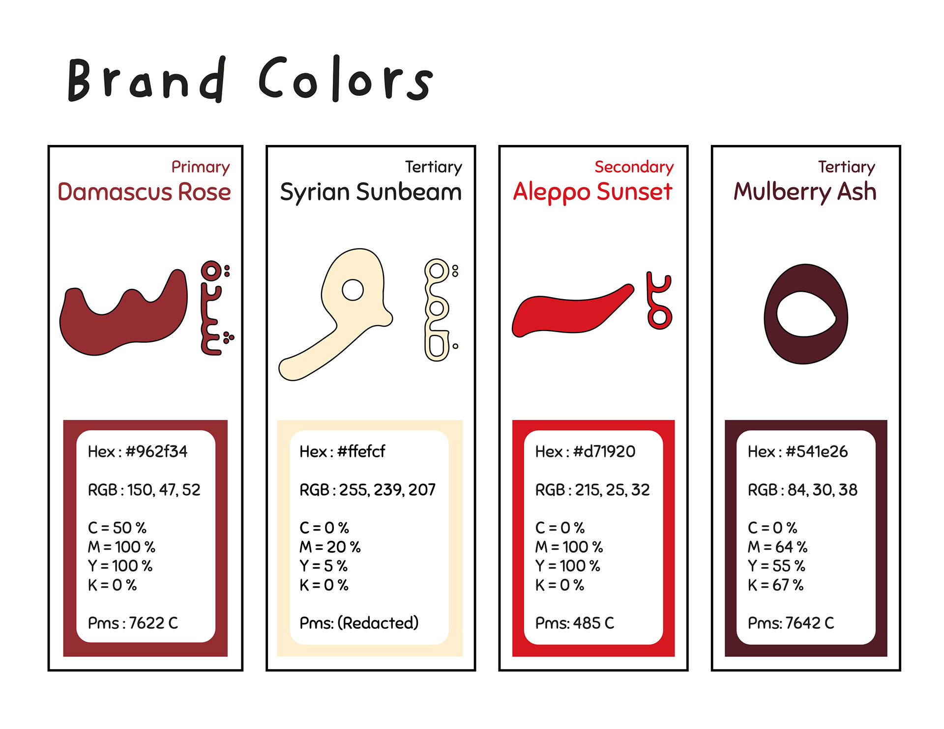
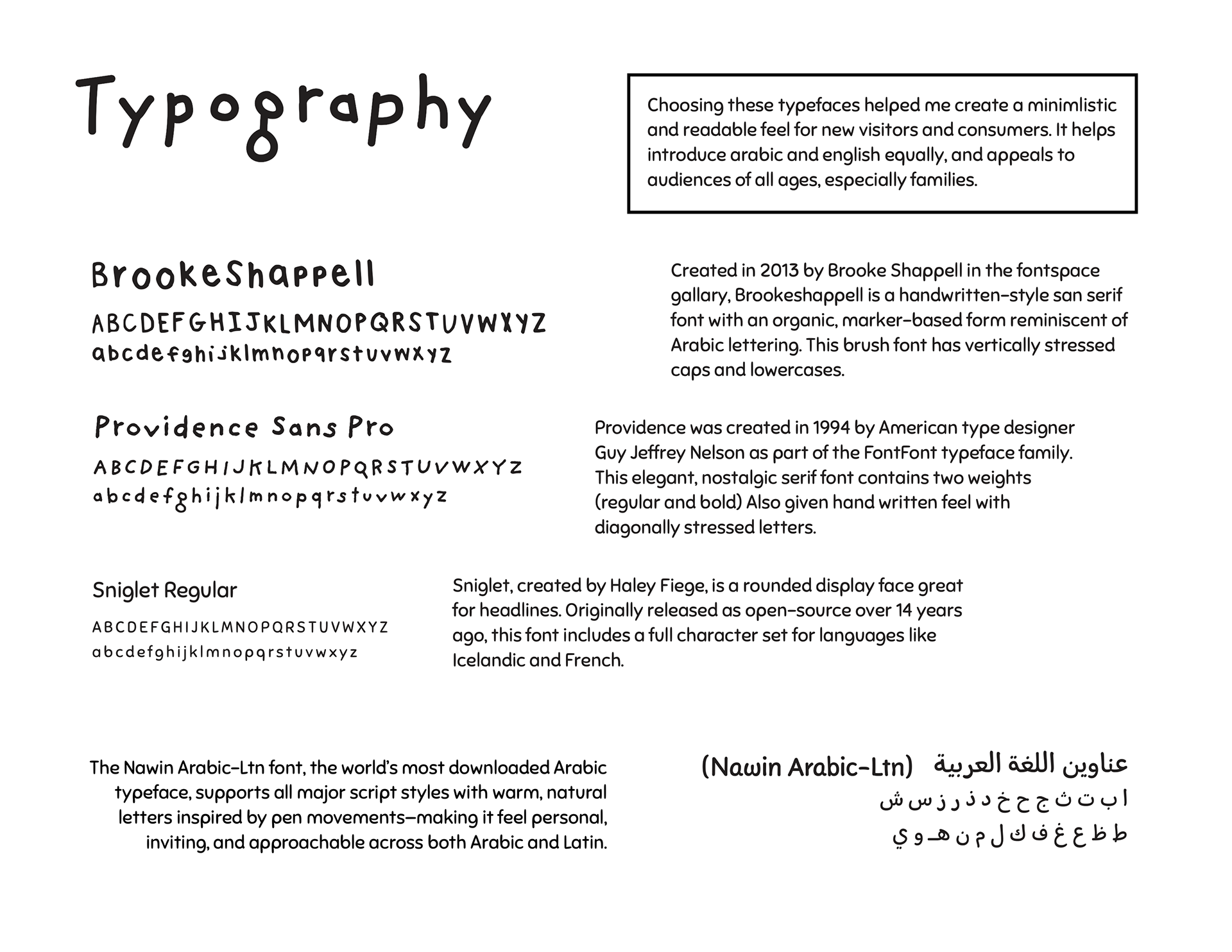
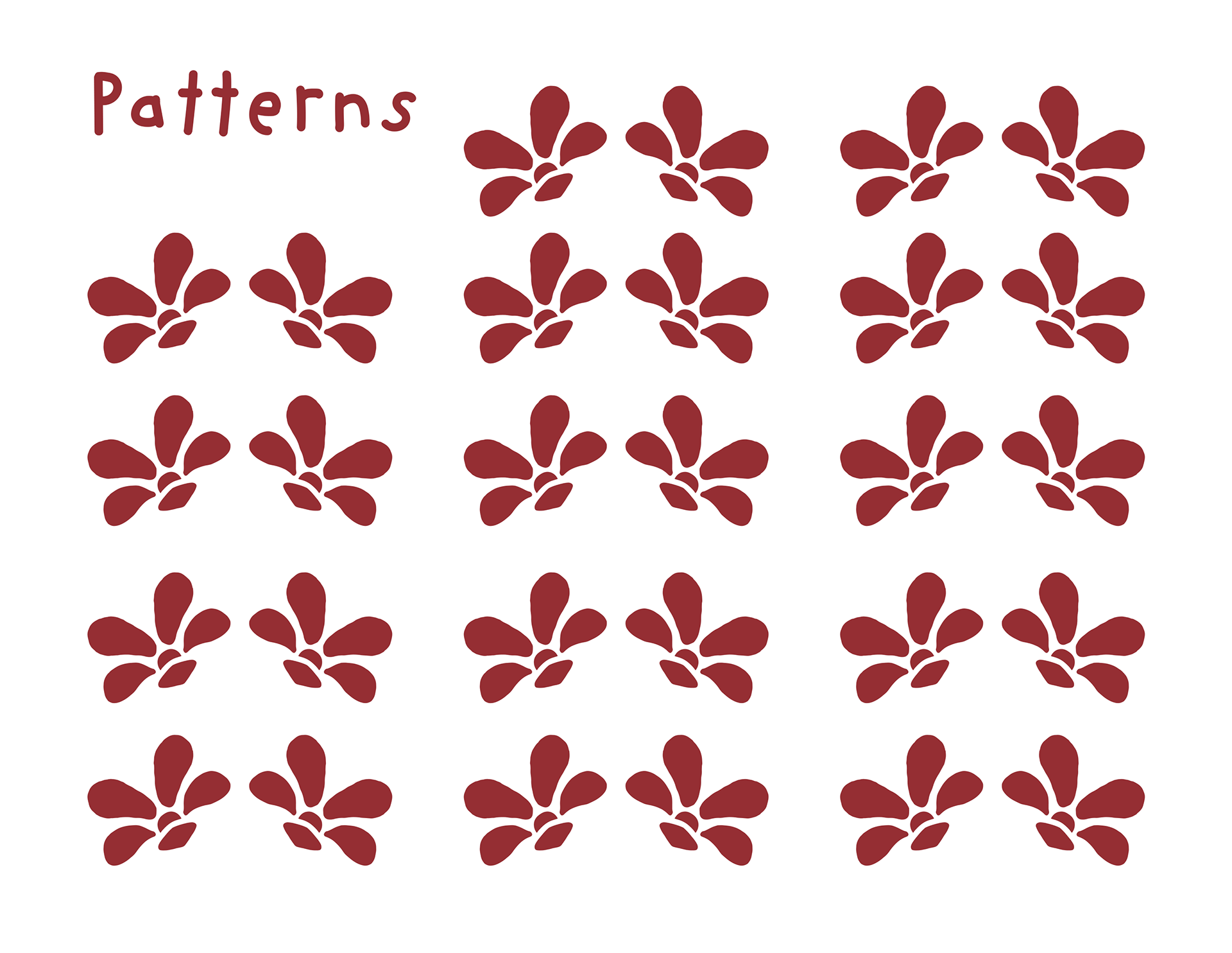
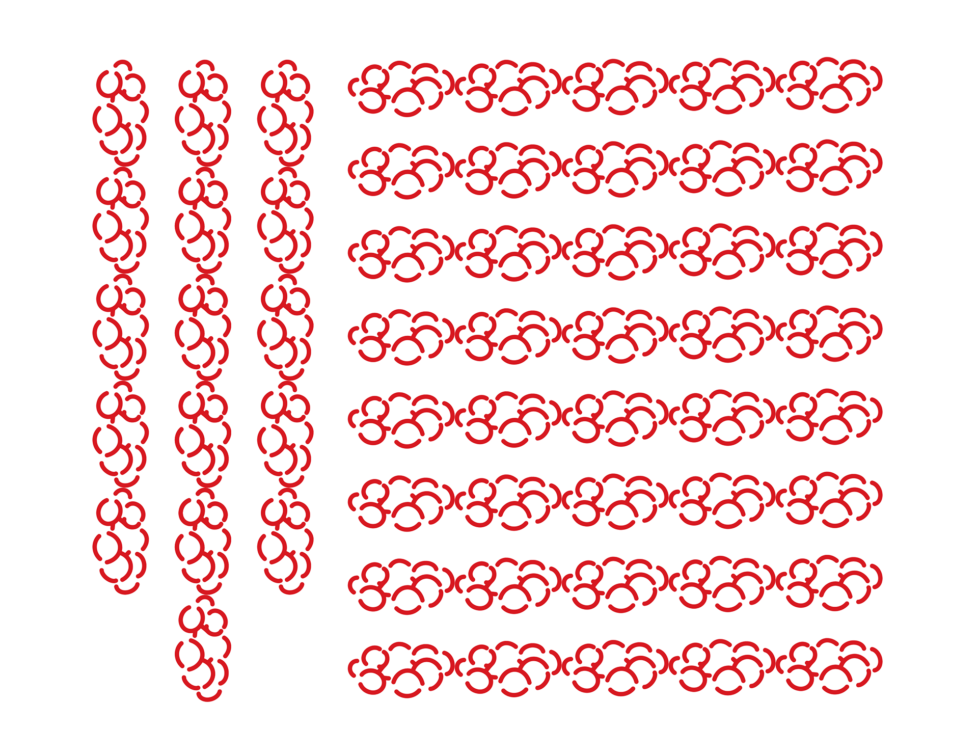
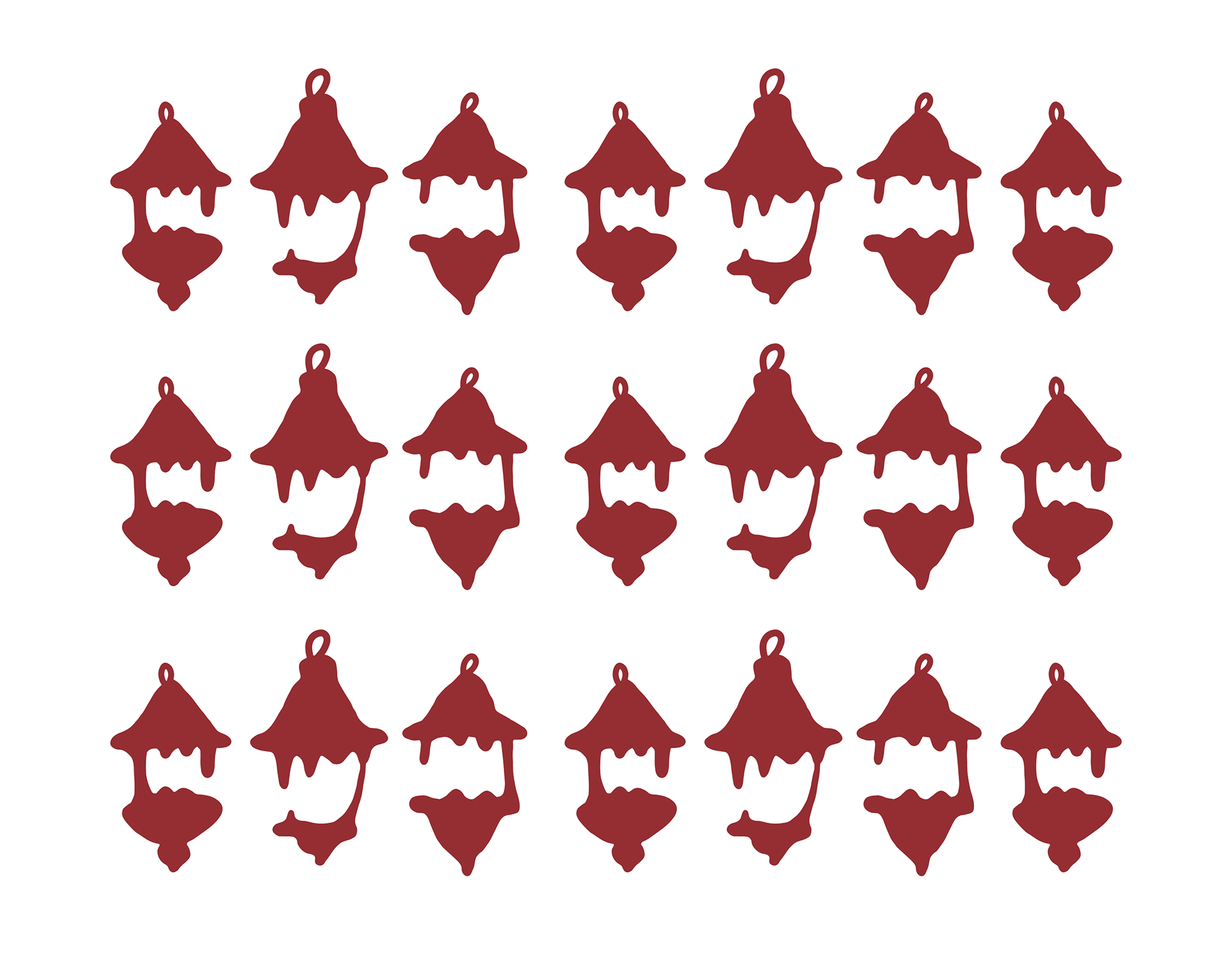
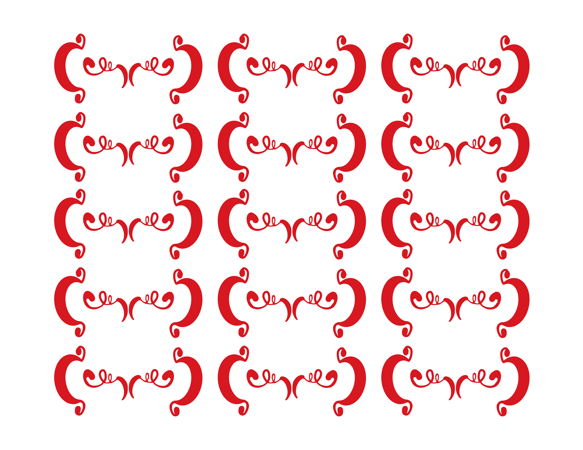
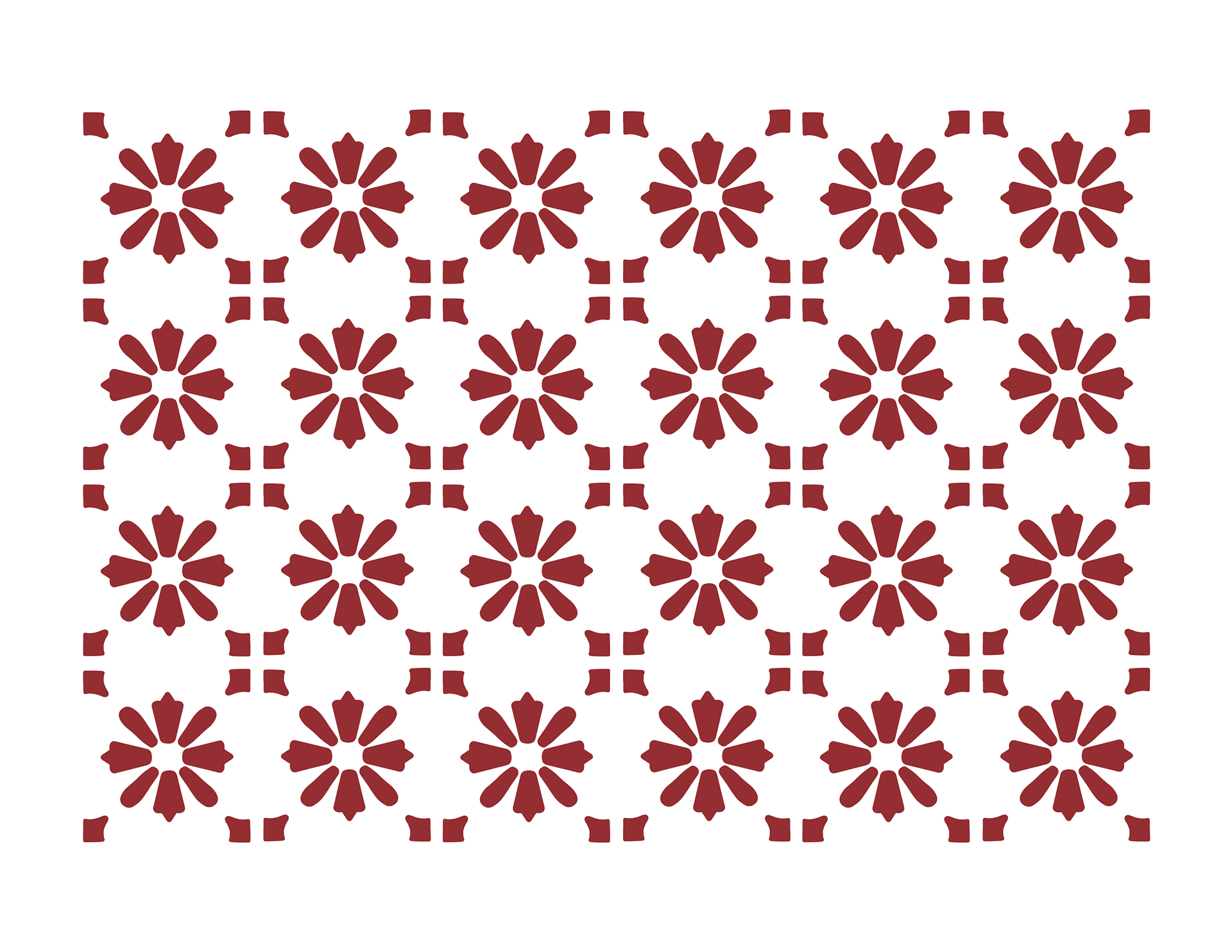
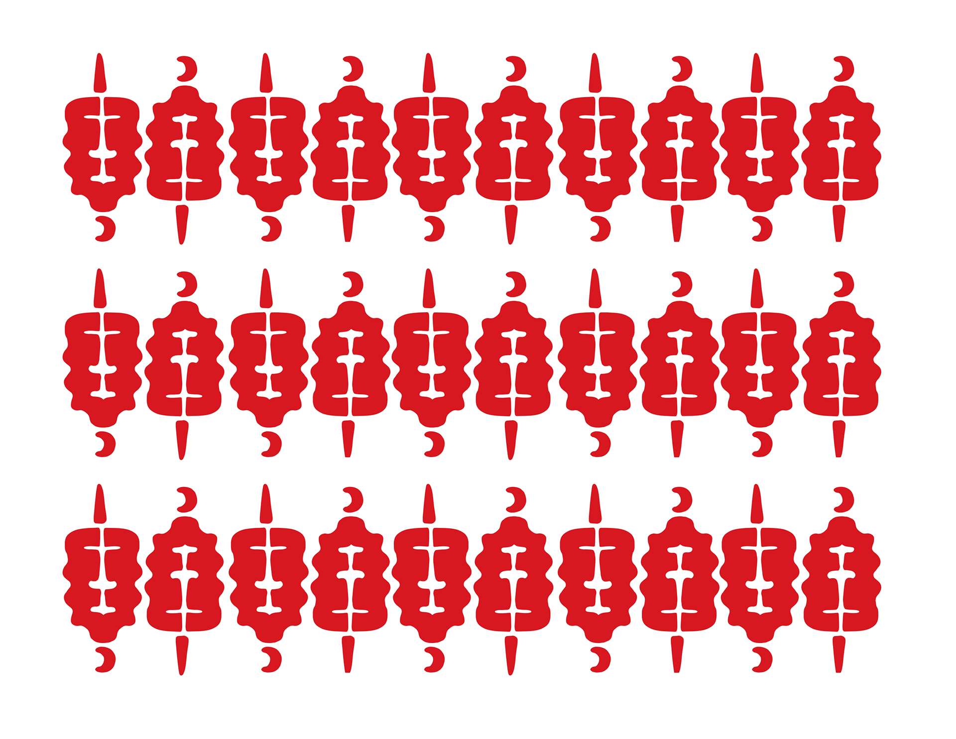
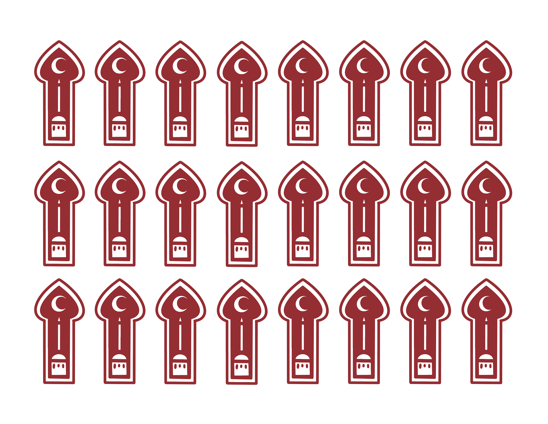
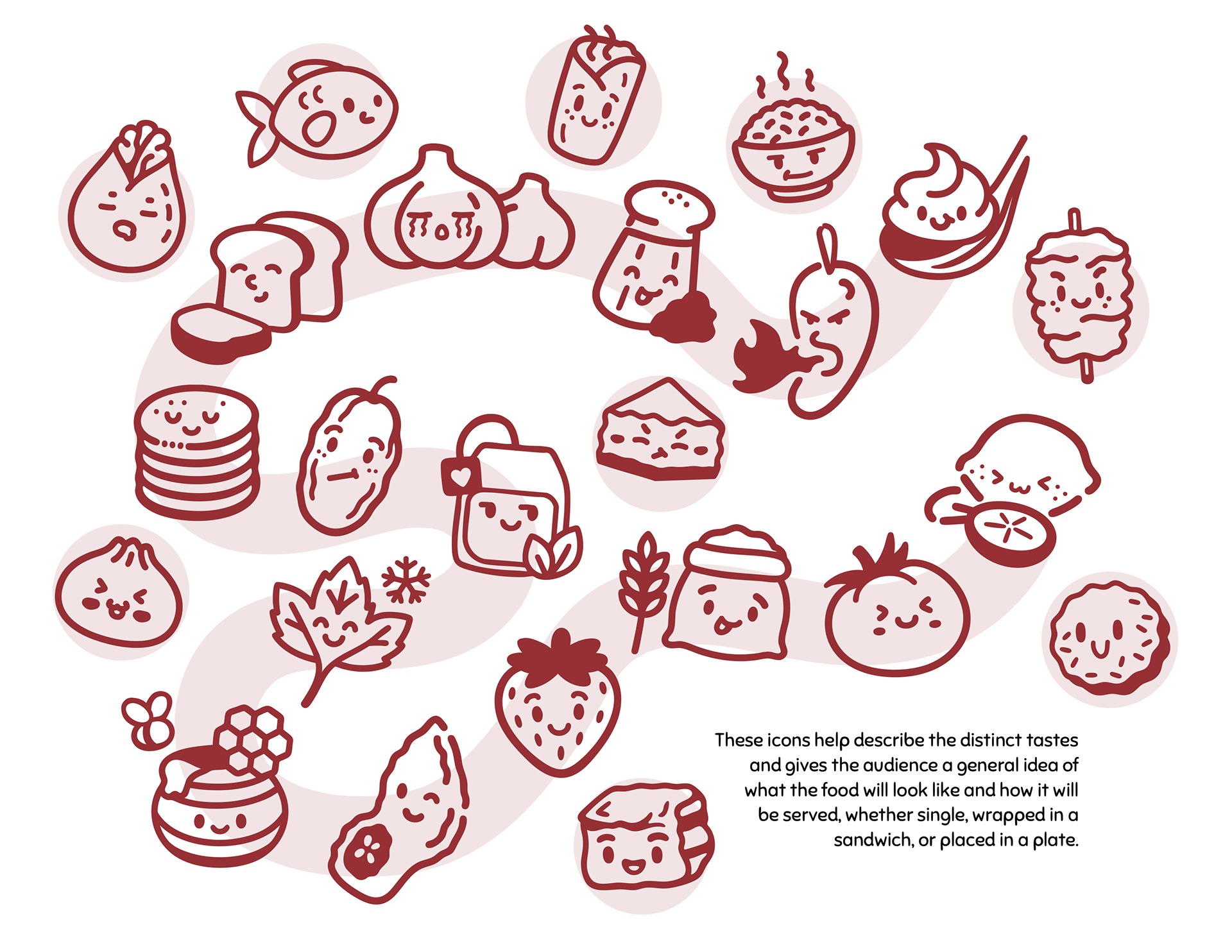
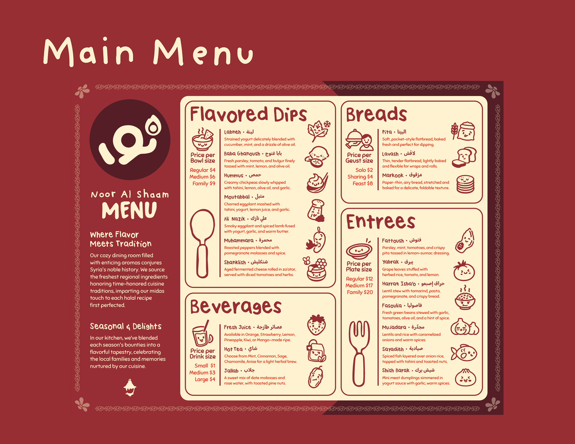
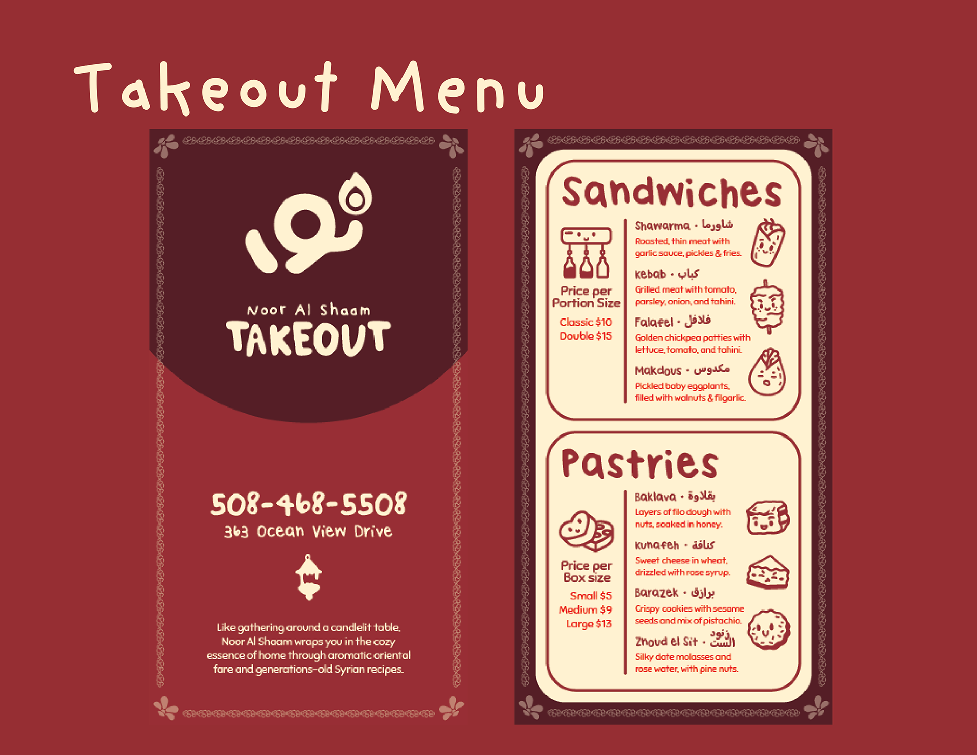
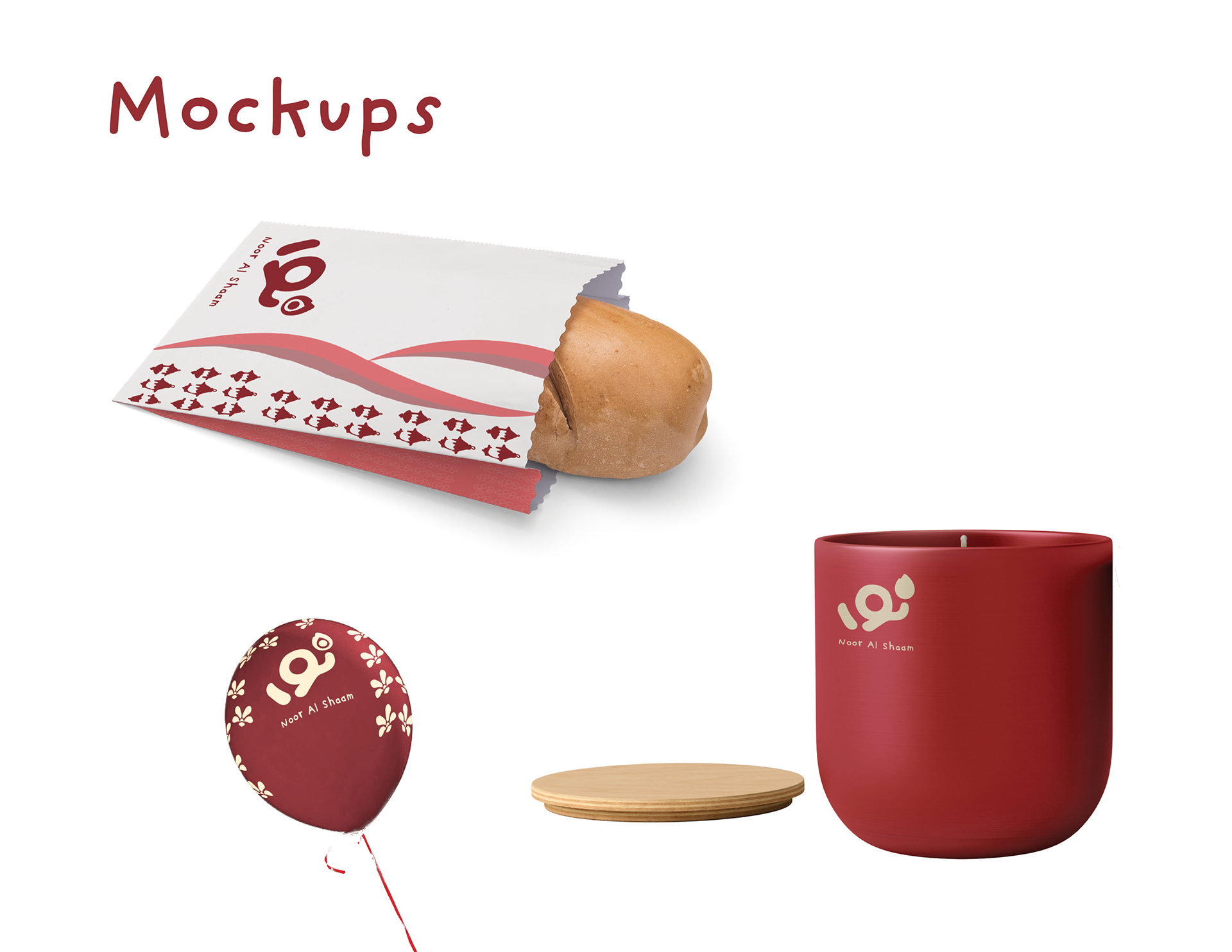
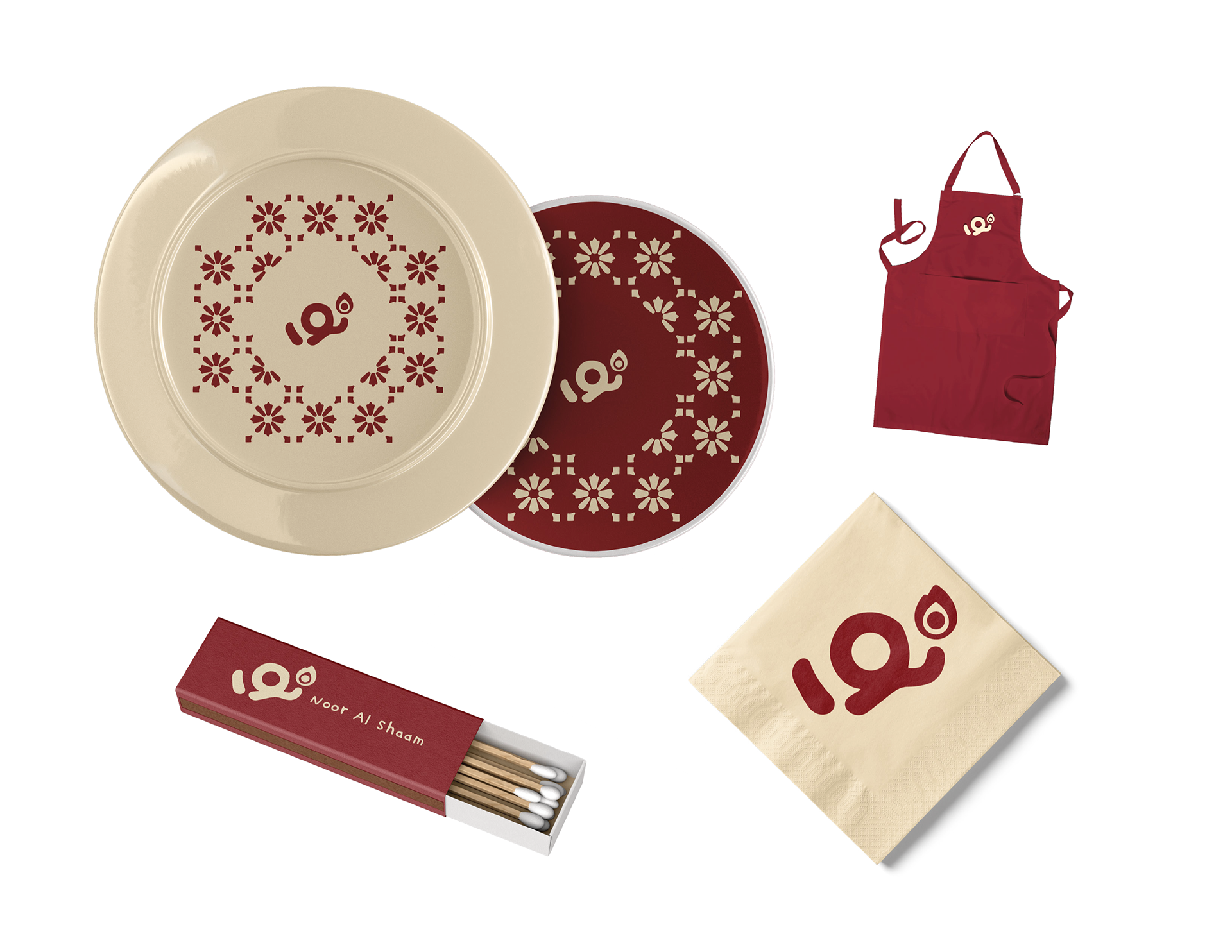
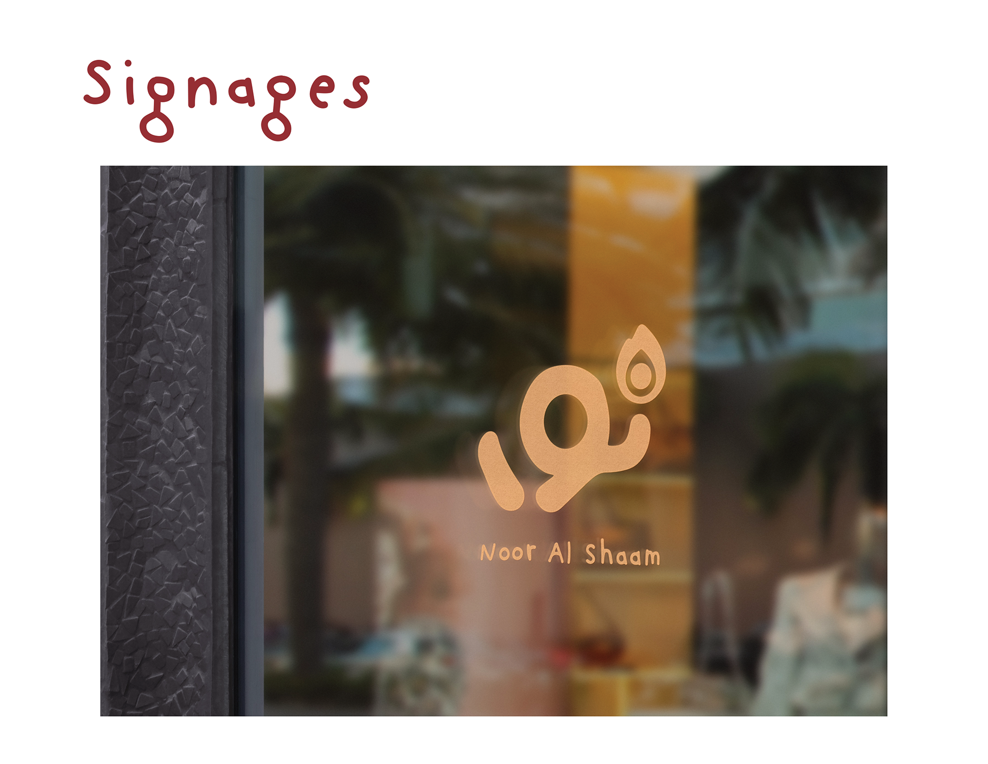
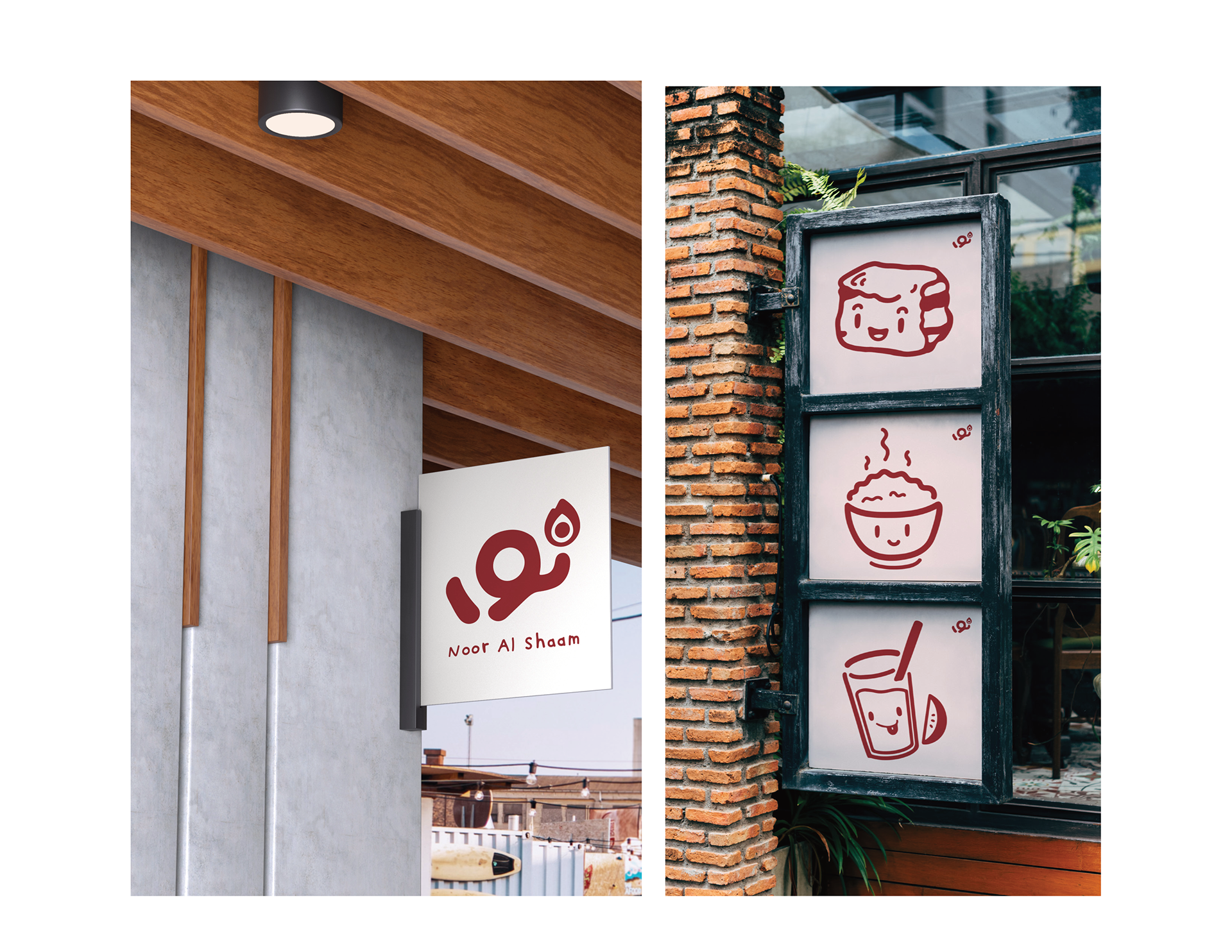
Noor Al Shaam—meaning “The Light of Shaam,” a reference to the historic Levantine region—was created as a solo restaurant branding project that honors Syrian heritage through a fresh, contemporary lens. While the overall process spanned a longer period, the finalization of the visual and print materials took about three weeks. The project included designing a printed menu and takeaway version that reflect the warmth and humility of Levantine hospitality, with a focus on breads, dips, and hearty entrees. Inspired by traditional Arabesque patterns, I incorporated Yasmin flower motifs and Ramadan lanterns, printed on canvas-textured paper to function as both menu and placemat—inviting diners to experience food as both cultural and visual nourishment. A warm desert-inspired palette, rounded typefaces, and slightly imperfect layout choices helped create a playful, family-centered feel that speaks to what a modern Syrian eatery could look like today. This project is a personal celebration of my cultural identity, blending the spirit of Assyrian cuisine with modern branding to offer a space that feels both rooted and refreshingly current.